

Build, streamline and evolve together with solution
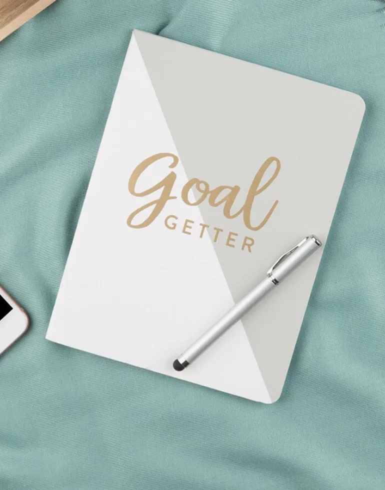
Brand cards, stationery and guidelines for a premium paper studio. We worked closely with the client team from discovery to launch, sharing ideas weekly and testing every direction with real users.
- Brand strategy
- UI/UX design
- Web development
- Art direction
- Launch support

Visual and typography hierarchy
A clear type scale and a small colour palette give every page a calm rhythm. Large, confident headings guide the eye, while generous spacing keeps the content easy to read on any screen.

The final system is documented in a shared library, so the client team can create new pages and campaigns with confidence long after launch.