
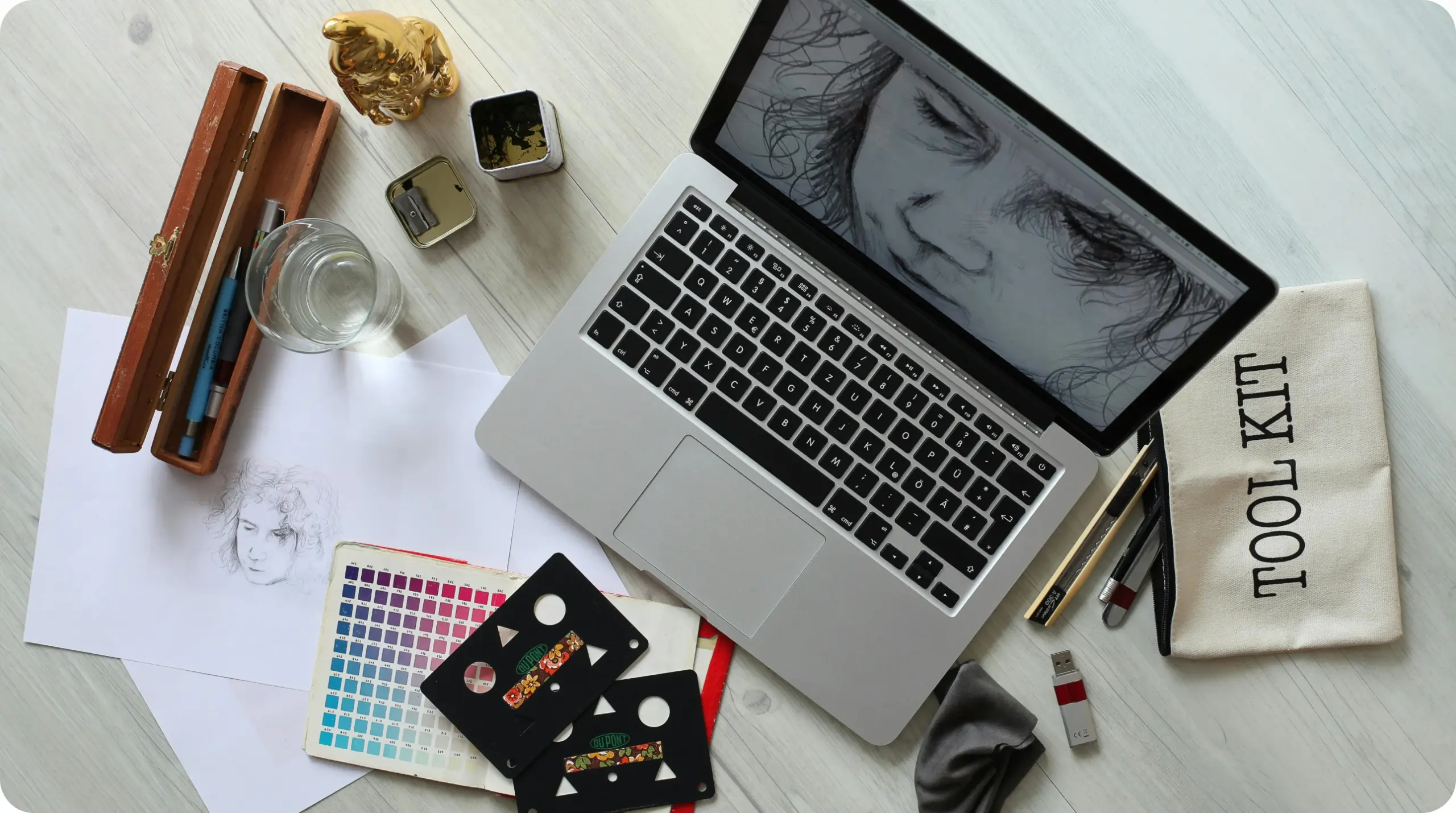
Effortless, comfortable and consistent: a brand people recognise before they read the name.
A digital product meets people in many places: the app store, an ad, an onboarding email and the product itself. A strong identity feels the same in all of them. Here is how we built one in three weeks.

We started with five words the product should feel like and tested every colour and typeface against them.
AI image tools helped us explore fifty directions in a day. The team then picked two and refined them by hand.
Custom experience
We watched how people used the product and timed every task. The brand rules then followed real behaviour, not opinions.
- Create the colour and type rules first
- Organise every asset in one shared library
- Design the app icon and onboarding together
- Check the identity on small screens early
Testing the identity with real users
Before we locked the brand, we showed three versions of the onboarding screens to twelve customers. We asked them which one felt most like the product they already used, not which one they liked best.
The answers were clear. People chose the calmest version, with more white space and fewer colours, because it matched how the product made them feel at work.
What we put in the brand library
- Logo files for light and dark backgrounds
- Colour values for screens and print
- Type sizes for headings, body text and buttons
- Ten example layouts for ads and emails
Every new page, ad or email now starts from this library. New team members can build on-brand work in their first week without a long handover.
The result was a brand the whole team could use without asking the designers every time, which is the real test of any identity.